Theming
Customising themes
Quick Start
To get started running your own PrezUI instance, simply run the following to get the starter template, replacing <project_name> with your project name (requires NPM installed, (we recommend pnpm)):
npx create-prez-app@latest <project_name>
or for pnpm:
npm dlx create-prez-app@latest <project_name>
Alternatively you can use the create command:
npm create prez-app@latest <project_name>
or for pnpm:
pnpm create create-prez-app@latest <project_name>
This will download a starter template Nuxt project extending PrezUI's base layer.
In the project root directory, install with your NPM package manager of choice:
npm install
or:
pnpm install
Then preview your theme by running:
npm run dev
or
pnpm dev
You may need to open the dev server (http://localhost:3000) in a second window in a private tab or different browser on first load to resolve the layout rendering error.
Tailwind & CSS
PrezUI uses Tailwind for most of its styling, which you can use in this starter template to easily style using classes.
To override PrezUI's colour scheme (e.g. primary, secondary, etc.), or add your own variables to use in Tailwind, simply add a CSS variable of the same name in app/assets/css/tailwind.css under :root with its colour values in HSL without commas between values. Dark mode variants of those variables goes in the .dark block. New variables are registered in the @theme inline block in the same file. For colours, prefix the variable with --color-*, e.g.:
/* app/assets/css/tailwind.css */

...

:root {
    /* define your Tailwind CSS variables (in HSL without commas) here */

    /* overridden variables */
    --primary: hsl(24.6 95% 53.1%);
    --primary-foreground: hsl(60 9.1% 97.8%);

    /* new variable */
    --my-new-variable: hsl(70 10.8% 91.3%);
}

.dark {
    /* dark mode variants of CSS variables go here */
}

@theme inline {
    ...
    /* any new tailwind variables you declare go here. Colours are prefixed with --color-* */
    --color-my-new-variable: var(--my-new-variable);
}
You can also style your PrezUI theme using normal CSS by adding your styles to app/assets/css/theme.css.
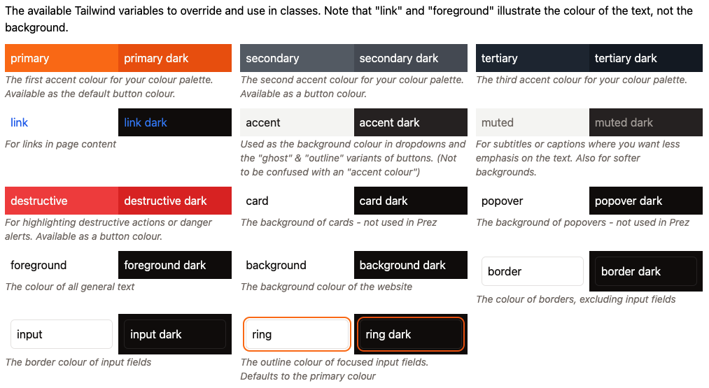
Tailwind Variables
PrezUI's Tailwind variables inherit from shadcn-vue's variables (link content out of date). See PrezUI's default Tailwind variables here.
Extending the base layer
This starter template uses layers to extend upon the base PrezUI layer application, so you only need to customise what you need.
The layers system automatically replaces files of the same name with the same directory structure as previous layers. The files that can be overridden are:
app/components/*- Extend the default componentsapp/composables/*- Extend the default composablesapp/layouts/*- Extend the default layoutsapp/pages/*- Extend the default pagesapp/plugins/*- Extend the default pluginsapp/utils/*- Extend the default utilsapp/app.config.ts- Extend the default app configserver/*- Extend the default server endpoints & middlewarenuxt.config.ts- Extend the default nuxt config
Refer to PrezUI's base layer source code to help you override files.
Override files at your own risk, as copying code means that future updates to overridden components must be done manually.
The most common case of theming PrezUI is adding a header, a footer, and modifying the nav for every page. This can easily be done by copying & overriding LayoutHeader.vue, LayoutNav.vue & LayoutFooter.vue in the components/ directory. If further layout modifications are needed, you can also override the default layout in app/layouts/default.vue.
shadcn-vue Components
PrezUI uses the prez-components component library, which is based on the shadcn-vue component library. Shad comes preinstalled in this starter template (badge, button, input, pagination & select are included as the base layer requires them), but if you need to add more shadcn components in your theme, run a command like the following to add the component:
npx shadcn-vue@latest add <component>
or
pnpm dlx shadcn-vue@latest add <component>
These components are stored in app/components/ui, which should be kept separate to your theme's components.
Other helpful tips
Assets such as images should go in the public/ directory. You can also replace the favicon in this directory by providing your own with the same name and file extension. If the favicon isn't the same extension, you can add it in the app config below as a link element.
nuxt.config.ts contains some useful config for customising your PrezUI theme further. Here you can customise the document title, add external CSS (such as fonts), the base URL, and more. See Nuxt Configuration for more details.
// nuxt.4.configuration.ts example
export default defineNuxtConfig({
    ...
    app: {
        head: {
            title: "<document_title>",
            link: [
                { rel: "stylesheet", href: "<stylesheet_url>", type: "text/css" },
            ]
        }
    },
    ...
});
app/app.config.ts is where you can configure smaller content-related options such as the nav content, naming on certains items, and breadcrumbs. For overriding array variables such as menu, use the arrow function syntax () => [] instead of re-setting the variable. Note you may get a false TypeScript error when doing this.
// app/app.4.configuration.ts example
export default defineAppConfig({
    ...
    menu: () => [
        { "label": "Home", "url": "/", "active": true },
        { "label": "Catalogs", "url": "/catalogs", "active": true },
        { "label": "Search", "url": "/search", "active": true },
        { "label": "SPARQL", "url": "/sparql", "active": false },
        { "label": "Profiles", "url": "/profiles", "active": true },
        { "label": "About", "url": "/about", "active": true },
        { "label": "API Documentation", "url": "/docs", "active": true },
        { "label": "Custom link", "url": "/custom", "active": true },
    ],
    ...
});